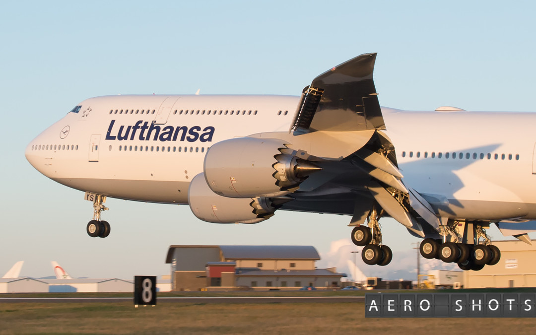
Lufthansa has announced that it will unveil an updated livery sometime during the second week of February. But before you get too excited or worried about what the new look might be, it will not be a radical departure from what is already in place. They key word is enhancement, not reinvention.
Some blogs and websites were panic-stricken at the thought of the new look, with some sites going as far as importing color schemes and drawings straight from fantasy land. I’m here to dispel that notion and the fake news and help bring some clarity to what will most likely be the final product.
Prevailing information suggests that ‘yellow’ will no longer have a major place in the Lufthansa color palette. Expect the new colors to be focused on the existing Blue, White, and add some Silver. For the cabin color schemes, expect much of the same, including the blues and browns (Business and Prem Eco cabin accents) currently found on most aircraft. What will be a new change will be the addition of lighter blues into the color mix. You can see now with their new A350s that light and medium blues are the primary colors throughout the Economy cabin.
As far as the exterior goes, I suspect that the yellow will be gone from the tail logo, and I fully expect it to be replaced with a white Crane inside the familiar circle. Expect the tail of the aircraft to remain blue, and the fuselage to stay white, though we might see the belly lose its grey color. It wouldn’t surprise me if the engine nacelles didn’t get dipped in blue paint to give the center of the aircraft a bit of contrast.
The font is also not expected to be changed dramatically if at all.
Remember, we are dealing with one of commercial aviation’s richest histories as well as logos and designs that have transcended nearly 100 years. Lufthansa is not about to throw it all out the door and come out with some new radical monstrosity of a look.
This might very well be the new color scheme that graces the vertical stabilizer on LH aircraft in the future (see, it’s not some radical reinvention):
In fact, visit this Lufthansa webpage, and click on the video which is full of hints as to what the new look will be. Though I can’t guarantee it, I think what I’ve mentioned in this post is a safer bet at this point than your Bitcoin account.
As it stands today, Lufthansa’s first 747-8i (D-ABYA) is parked in a hangar in Rome going through her facelift to reflect the change and will be the aircraft that debuts the new look. If things go to plan, we’ll see the new look during the week of February 12. Keep in mind with such things that changes in the timeline are highly possible.
H/T: FlyerTalk’s Oliver2002 & the Miles & More Thread for some of the images and links in this post.


LH should focus on execution rather than colors.
Just landed at EWR on a full 748. LH subcontracted to a firm that had one person unload a full 748. Hundreds of pax waiting 2 hours. LH employees present became rude and threatening. Many missed connections.
LH focus on what counts rather than BS publicity.
Thanks for the heads up. I like the yellow, grey, blue, white combination. Like the red, black, grey with JAL. Recall their logo change. A flop and they went back to the old. Iberia certainly too is a flop as was the poor decision/design of Air Canada, the ‘old’ design was truly artistic.