LUFTHANSA has unveiled the update to their livery to mark ‘100 years of the Crane’ and quite honestly I must say that I like it!
Certain elements have been removed, but replaced with new and updated features that will really help the LH fleet stand out.
What’s changed:
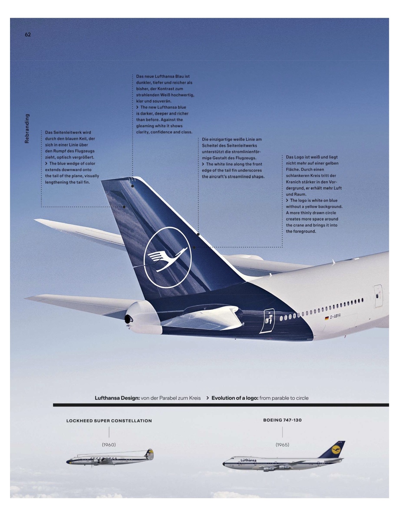
- Lufthansa has decided to forego the yellow and blue logo that adorns the tail and replaced it with a white logo surrounded by a new, darker and more rich blue that will extend from the tail and follows the tail’s line onto the fuselage.
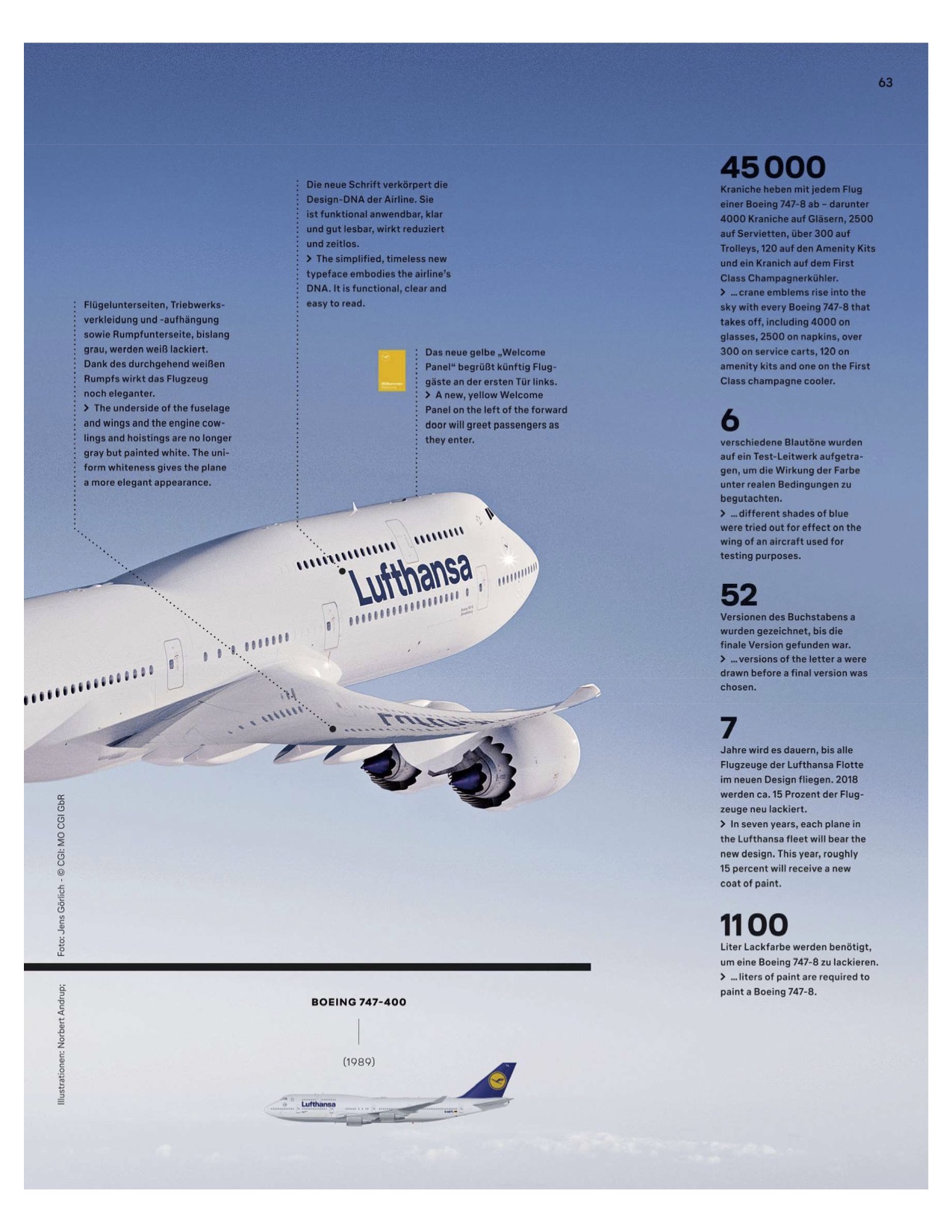
- The grey belly is also a thing of the past. The planes will now be fully white, except for the blue found in the tail section.
- A minor update to the font as well, but not so much that it looks radically different.
To see how it all comes together, here are a couple of pages from Lufthansa’s inflight magazine that highlight the changes and discusses them in a bit more detail. The only thing I wish that would have been considered was to bring the new blue color onto the engine nacelles to really ‘pop’ the middle of the aircraft.
As you can see below the front of the plan looks fairly identical to the current look except for what LH refers to as a ‘simplified, timeless new typeface’…..which still looks very much as the current version.
The rear of the aircraft is where we really see the impact of the new look. Lufthansa has gone with a darker blue for the tail, and as I mentioned earlier, the yellow circle and blue crane have been replaced with a sleeker version of the 100-year old logo. Additionally, the blue now flows onto the fuselage to accentuate the lines of the tail. You’ll also notice that they paint the leading edge of the tail white to further help show off the plane’s geometry. Though by keeping it white, it also prevents paint chips from being too obvious. Take a look at an older Singapore A380’s tail and you’ll see what I mean, the leading edge of the tail takes a lot of abuse!
These changes will not be limited to only the aircraft. LH over the coming months will refresh everything to reflect the new look, including stationery, airport signage, media graphics, all the way down to the hangars that are found aboard their aircraft. In fact it will take a few years to get hundreds of aircraft to sport the new look. Each aircraft will be repainted as it goes in for normal ‘heavy’ maintenance.
I think Lufthansa has knocked it out of the ballpark with this new look. Fortunately, they decided to honor the Crane and her 100 years of flying with Lufthansa but they brought her into the 21st century in a beautiful and modern way.
I very much look forward to seeing it in person.


I agree engine nacelles needing colour, although my first thought was yellow. Otherwise a complementary pale blue, the old light grey, or the new dark bluewould be smart.
I wish they would focus on updating the INSIDE. Having 2-2-2 seating in long-haul business class is a joke for a “5 Star” airline. (Yes, I know United has 2-4-2 on some planes–even worse but United does not have 5 stars.)
you’ll see new colors on the inside, but unfortunately not much is changing with lay out. The 777x will start to change that I think.