

Lufthansa has unveiled a new look to their website for passengers booking travel from the USA. The new online booking interface improves upon the previous version by being more graphical and providing more information during the booking process than was previously made available.
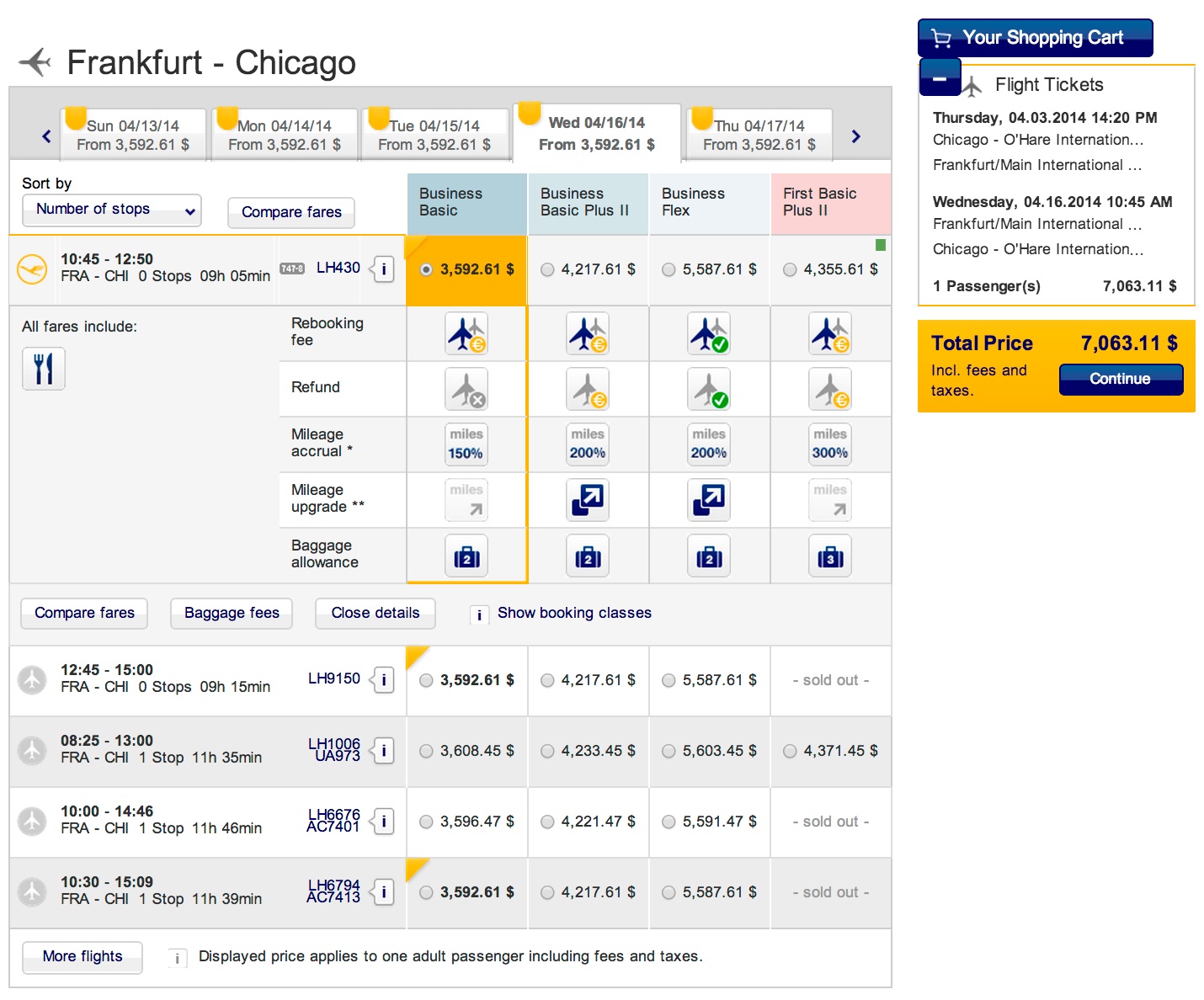
Some of the highlights include being able to see fares for 3 days before and 1 day after your planned travel dates which will let you see if there are more attractive fares for leaving a bit earlier or later. No longer do we have to cross reference a grid!
The new graphics also make it much easier to interpret some rules and conditions of the fare such as the amount of miles that you will earn, baggage allowance and whether or not fees are assessed for canceling or rebooking seats.
With the new launch, Lufthansa also allows you to pick premium seats in economy that may offer more leg room or have other advantages (bulkhead, front of cabin, etc) and pay for them at time of booking. According to Lufthansa they will also begin to offer ‘Online Chat’ services if you need to ‘speak’ to a reservation specialist during the booking process.
Here is a brief walk through of the new booking interface:

After entering your origin, destination and dates from Lufthansa’s main page, you are brought to this view that shows you the various class options as well as variable travel dates. You’ll notice that icons have replaced text that was prevalent in the previous booking interface. If you run your pointer over any of the icons, additional information will be provided in a pop-up. The new look makes it easier to take in a lot of information with just a glance.
Scrolling down after picking your outbound leg, you are given options for the return flights.
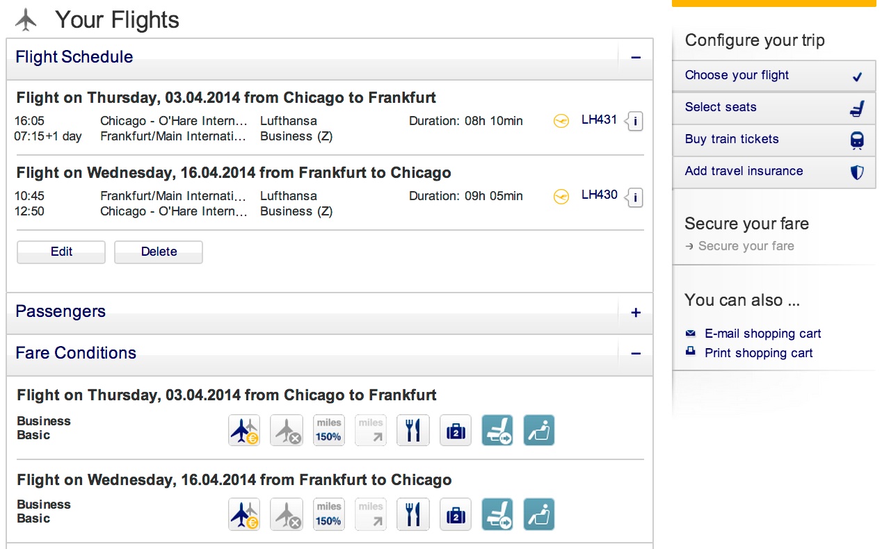
After confirming your flights on the first page, continuing on will bring you to the second page which summarizes your itinerary. This is the top half of the screen.
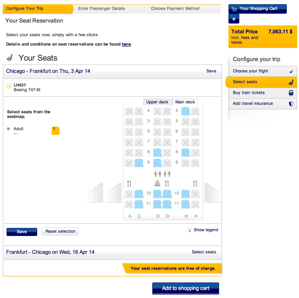
The bottom half provides a very easy to understand seat selection chart. Since this is a Business Class booking there are no premium seats that would cost more. Had this been an Economy booking, you would see premium seat options and their costs.

After review and seat selection you are brought to the screens that require your personal information, payment details, etc.

The bottom half of the page asks for more personal details.
In all, I think this is a nice improvement over the previous version and more enhancements will be introduced over time. What I really like is the use of icons to replace text to provide certain information and the fact that each icon can be highlighted to get further details. In my opinion it looks a lot cleaner and is more intuitive.
If you have any questions, feedback or challenges with the new look let me know!

I like the new interface, however, I have yet to find out where it displays the exact booking classes to make sure I book into a mileage earning class (I collect to UA MP).
Its located right below the column after you select a fare for each direction. See the image below. It will say ‘Show booking class’ with an ‘info’ icon next to it:
Perfect, thank you!
It also appears that you have to sign in to look at your bookings. Am I missing something here?
No, you’re not missing anything. This is a known ‘glitch’ that is being worked on. If you need to see your reservation or check/change seat assignments, you can actually do that through LOT Polish airlines website at LOT.COM.